
The Buffalo Bills' helmet logo, which debuted in 1974, is now in its 40th season, making it one of the more durable designs in the NFL. In that span, Buffalo's helmet color has changed from white to red and back to white, and the helmet's face-mask color and striping pattern have been revised several times as well. But the familiar design of the charging buffalo has remained unchanged.
Unless you're a serious Bills scholar, you probably have no idea who designed that logo. Until a few months ago, neither did I. That's all too typical in the uni-verse, where we tend to attribute designs to faceless organizations ("The Dolphins came out with a new logo" or "Nike created new uniforms for the Vikings") instead of living, breathing designers. The men and women who do this work deserve better.
So I'm happy to be able to tell you that the guy who designed the Bills' logo was a talented commercial illustrator named Stevens Wright. In addition to creating the charging buffalo, he also designed the 49ers' infamous "one-day logo," created a formative version of the Patriots' Flying Elvis helmet logo, and designed prototype logos and helmets for the Chiefs and Vikings, among other projects. In short, this guy was a major player in NFL design, even if most fans (and a certain uniform columnist) never heard of him.
The bad news is that I learned of Wright's identity by reading his obituary, which ran in the Buffalo News after he passed away in March. The good news is that Wright's family has generously provided me with a wealth of archival materials from his files. These materials, which have never been published, give us a rare peek into the workings of the NFL design process from the 1970s, '80s and early '90s, back when there was no email, no digital design software, no focus groups, marketing studies or branding consultants -- just a few gents working at drafting tables with pencils and markers.
Let's take a team-by-team look through those files, beginning with Buffalo.
Bills
Stevens Wright did most of his 1960s and '70s illustration work in the aerospace industry, but his wife, Jere Wright, was a production manager for NFL Properties, the group that handles all of the league's licensing and branding. Jere brought her husband's talents to the attention of David Boss, who was the director NFL Properties' creative services division at the time. Boss promptly gave Stevens a plum assignment: creating a new logo for the Bills.
Although Wright's original sketches are gone, he apparently came up with several designs that were submitted to the Bills in summer the summer of 1973. Team general manager Robert Lustig responded with a letter to Boss in which he expressed a strong preference for the design that ultimately would become the charging buffalo (click on letter to enlarge):

The finished logo, with the red stripe modified as Lustig had requested, ended up on the Bills' helmet the following season. "He was always happy with how it turned out," says Wright's daughter, Beverly Wright Woo. "And he was particularly happy that they went back to the white helmet a few years ago. He never liked it on red."
Wright Woo says her father considered the charging buffalo to be his greatest accomplishment. "Toward the end of his life, he said you really do look back and think about your legacy, and he said, 'Well, I made a mark with that Bills logo.' He really treasured it."
Patriots
The 1979 season was supposed to be the swan song for Pat Patriot, New England's helmet logo character. The team had commissioned a new helmet logo from NFL Properties and was planning to use it in 1980. Everything was set to go.
But then team owner Billy Sullivan got cold feet and decided to put the new logo up against the old one for a fan vote during halftime of a Patriots game, which resulted in the new logo being booed out of the stadium. Pat Patriot remained on the helmets until 1993, when he was replaced by the logo now known as Flying Elvis -- who looks a lot like the logo the fans rejected back in '79. (For more details on all of this, look here.)
When I first wrote about all of that a few years ago, I wasn't able to determine who had designed that 1979 logo for NFL Properties. But it turns out it was Stevens Wright.
"That was hard on my dad, having his design booed like that," Wright Woo says. "And he watched it happen on TV! He was surprised, actually, because he really felt it was so much better than what they were already using. And he had enjoyed working with [Pats marketing director] Micéal Chamberlain."
That work stretched for several years. It's hard to piece together the exact chronology, but it appears that the Patriots originally asked NFL Properties to start designing a new helmet logo in 1976, presumably to coincide with the nation's bicentennial. Wright prepared several logo concepts, including these:
The 1976 project apparently was put on the back burner until June 1979, when the Patriots asked for it to be revived. Wright spent the next two months exploring a lengthy series of logo concepts involving various combinations of stars, stripes and Minuteman faces:
After a lot of back-and-forth negotiating between the team and NFL Properties (documented in this remarkable series of memos -- you can click on the thumbnails to see larger versions), the Patriots finally approved one of Wright's designs, which was then mocked up onto a helmet (click to enlarge):

This is the logo that was booed off the stage during the fans' halftime vote. But Wright's designs were later used as visual reference by Stan Evenson and Ken Loh, the designers who created Flying Elvis in 1993. So although Wright's design never made it onto the field, he still had a role in the evolution of the Patriots' current logo.
49ers
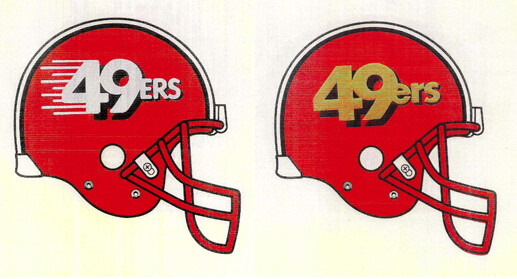
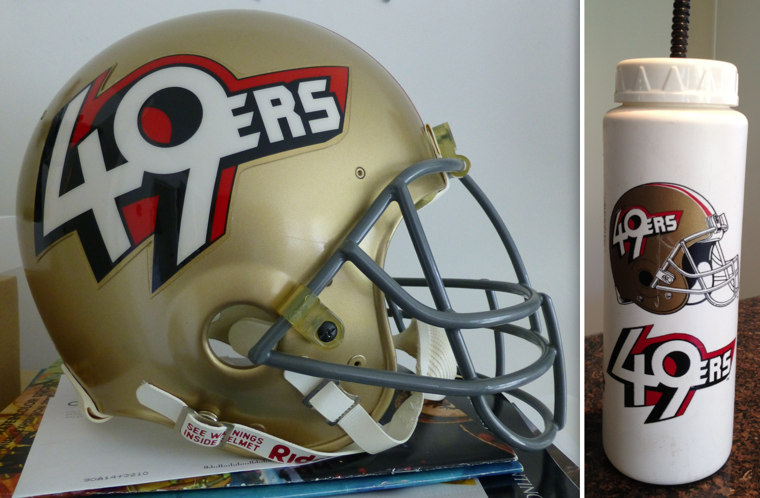
It's one of the most infamous chapters in NFL uniform history: In 1991, 49ers owner Eddie DeBartolo Jr. held a news conference, during which he proudly unveiled a new helmet design for his team. Twitter and Facebook didn't yet exist, so fans responded by flooding the team's switchboard with outraged phone calls. The response was so swift and so severe that the Niners basically said "never mind" the following day and withdrew the helmet design, which never made it onto the field.
The man who designed that logo -- in other words, the man whose work was once again booed off the stage, just like in New England -- was Stevens Wright.
"He was disappointed, sure, but he had a good sense of humor about it all," Wright Woo says. "He didn't take it personally, because he just gave the 49ers what they had asked for. It wasn't as much of an artistic design, like what he'd done for the Patriots. For me, though, it was horrible to see it get hammered like that, on the news and everything."
It could have been worse. Wright's files show that at one point he was tinkering with a red helmet shell for the Niners, which probably would have had fans reaching for the torches and pitchforks:
The files also contain a handwritten memo to Wright from Boss. There's no date on it, and it's not clear which phase of the design it's referring to, but it stresses that "DeBartolo wants to emphasize 49ers, not SF."
Wright Woo thinks this emphasis on the team over the city is part of why fans reacted so negatively to the design. "There was a lot of grumbling about the team moving at that time," she says. "They had moved their offices, the stadium supposedly wasn't that good, and all that. So aside from how the design looked, which I know some people may not have liked, I think people viewed the missing 'SF' as part of the plan to move the team."
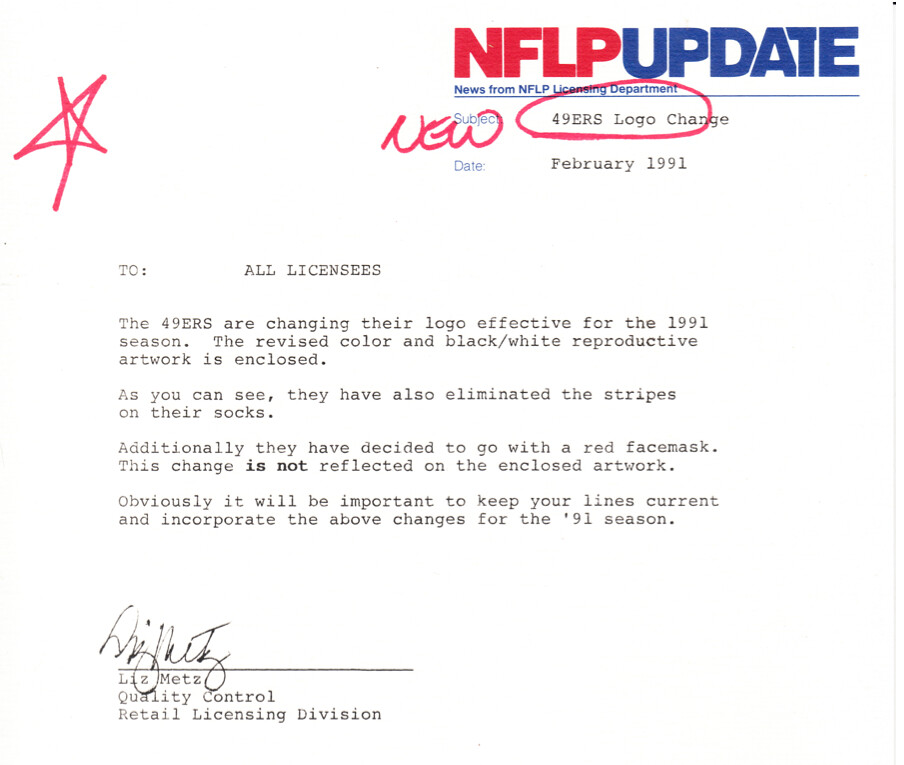
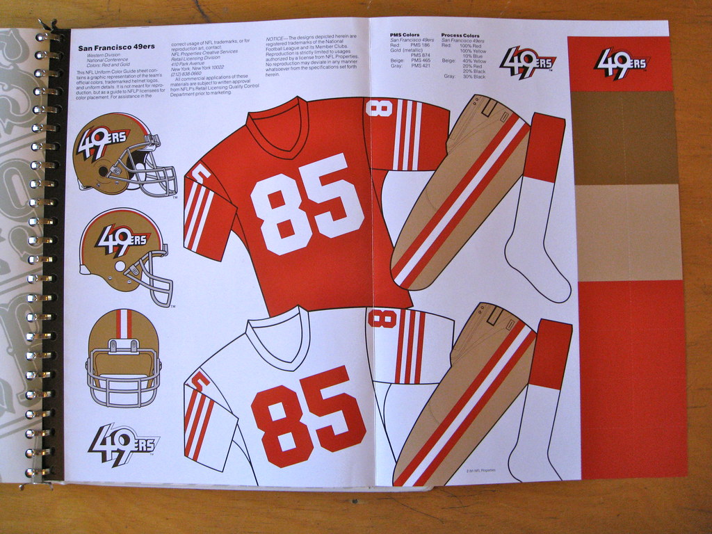
In any case, Wright's design was mothballed -- but not before it had already been incorporated into the 1991 NFL style guide and been licensed to some of the league's corporate partners. Here's a memo that accompanied the '91 style guide, along with the official style sheet showing the new design (click to enlarge):
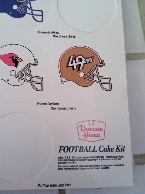
And here's an unlikely place where the design showed up -- as part of a Duncan Hines cake decorating kit! The team's decision to scrap the helmet apparently came too late to stop this from hitting grocery shelves in fall 1991:
If Stevens Wright was frustrated by his experience with the 49ers, it didn't prevent him from keeping two souvenirs that are now priceless collectors' items -- a water bottle and a helmet (click to enlarge):
Chiefs
The Chiefs have had the same helmet logo throughout their history, and the party line is that they've never considered changing it. But Wright's files indicate the team was pursuing a redesign in 1983. Boss assigned the project to Wright, explaining that the Chiefs' newly hired coach, John Mackovic, wanted a look that was "more contemporary, more action-oriented." (Boss also provided Wright with some concepts by another designer that the Chiefs had already rejected, along with some rough sketches that Boss himself had made while on the phone with Chiefs PR director Bob Sprenger.)
Wright came up with the following designs, which were submitted to the team (click to enlarge):
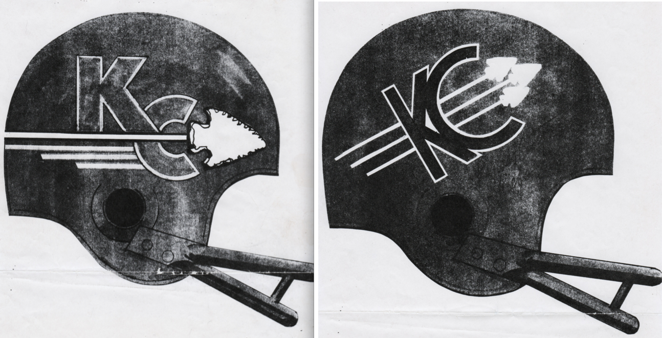
The Chiefs responded with a letter asking for a simpler approach, so Boss bounced the project back to Wright for revisions. It's not clear when the project was abandoned, but the Chiefs never did change their logo.
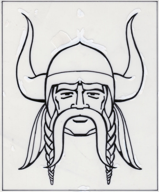
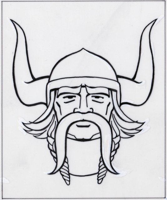
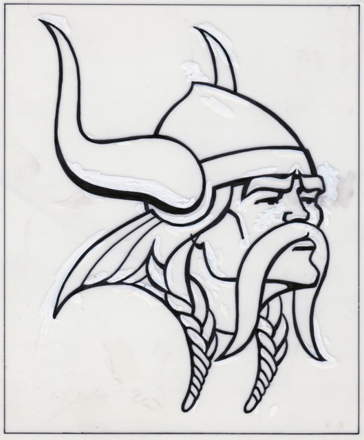
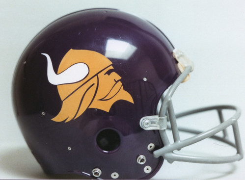
Vikings
At one point, Wright apparently was working on a new logo for the Vikings, at least one of which was mocked up onto a helmet. Unfortunately, Wright's files don't have any memos or other correspondence relating to this project, so it's impossible to know the backstory or time frame on these designs. But it's still fascinating to learn that the Vikings were considering changes to their look at some point:
Broncos
In addition to doing logo designs, Wright also did other work for NFL Properties, including cover designs for the NFL's Pro! magazine. In spring 1981, he worked on a cover illustration for the Broncos, who had just hired 37-year-old Dan Reeves, making him the youngest head coach in NFL history.
Reeves had spent the previous seven seasons as an assistant coach with Dallas, so Wright found a sideline photo of him standing next to Cowboys quarterback Danny White and used it as the basis of an illustration showing Reeves with an unnamed Bronco (click to enlarge):
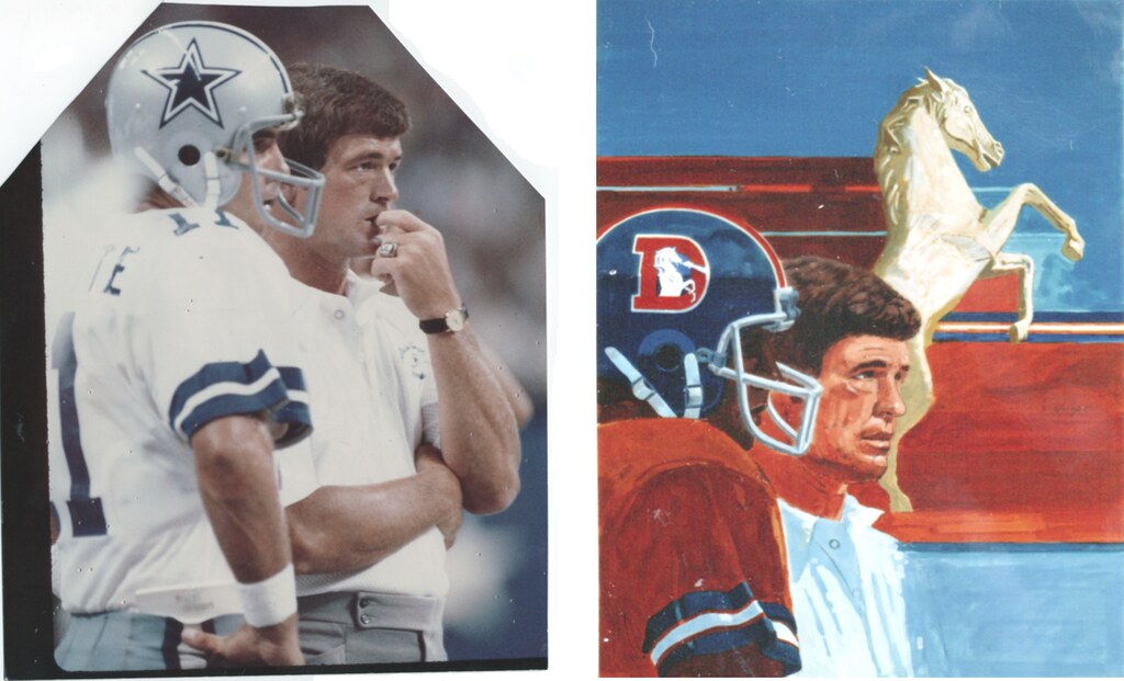
Unfortunately, Broncos owner Edgar Kaiser believed that showcasing Reeves on the cover might put too much pressure on the young coach, especially because the team was rebuilding. He vetoed the cover design, as Boss explained to Wright in a handwritten note and a more formal letter. Boss mentioned that there was some chance the illustration might be used the following season, although it's not clear if that ever happened.
Fascinating stuff. Whatever you think of Wright's designs, his files provide a remarkable glimpse into how NFL logos were created a few decades back. Oddly enough, even though everything was done by hand and sent back and forth through the mail, the design process was much faster back then, because there were fewer layers of corporate bureaucracy and fewer merchandising licensees to deal with. So Wright, Boss and their contemporaries could do within a few months what now takes at least two years. Whichever approach you think is better, one thing is clear: Things sure have changed.
(Special thanks to Beverly Wright Woo and the Wright family for sharing Stevens Wright's archival materials.)
Paul Lukas, a lifelong 49ers fan, is glad the team stuck with its "SF" logo. If you liked this column, you'll probably like his daily Uni Watch web site, plus you can follow him on Twitter and Facebook. Want to learn about his Uni Watch Membership Program, be added to his mailing list so you'll always know when a new column has been posted, or just ask him a question? Contact him here.