
For the most part, we get to see new uniform designs only when teams are ready to show them to us. Behind the scenes, however, most teams and their uniform suppliers are tinkering with new design possibilities on a fairly regular basis. For every design we see on the field, there are dozens more that are proposed, considered and rejected. Some of these concepts never get off the drawing board; others come tantalizingly close to being put into production before being quashed at the last minute. Either way, fans almost never get to see these prototype designs.
Occasionally, however, we get to peek behind the curtain, and today is one of those occasions. In the fall of 2003, Reebok prepared a series of new uniform designs for the Minnesota Vikings, with the idea that one of them would be chosen for use in 2005. As it turned out, the proposed designs were all scrapped and the Vikings stuck with their existing uniforms in 2005. (They eventually went with a different uni redesign in 2006.) That might have been the end of it, but a former Vikings employee saved the Reebok design proposals and recently shared them with Uni Watch. Another Vikings employee from that era has confirmed the designs' legitimacy. They provide a fascinating glimpse into what the Vikings and Reebok were considering about a decade ago.
Reebok proposed five separate design templates, each of which was presented in a series of three mock-up sheets. All are dated Nov. 18, 2003. Let's take a look, one template at a time (for all of these images, you can click on a design to see a larger version of it):
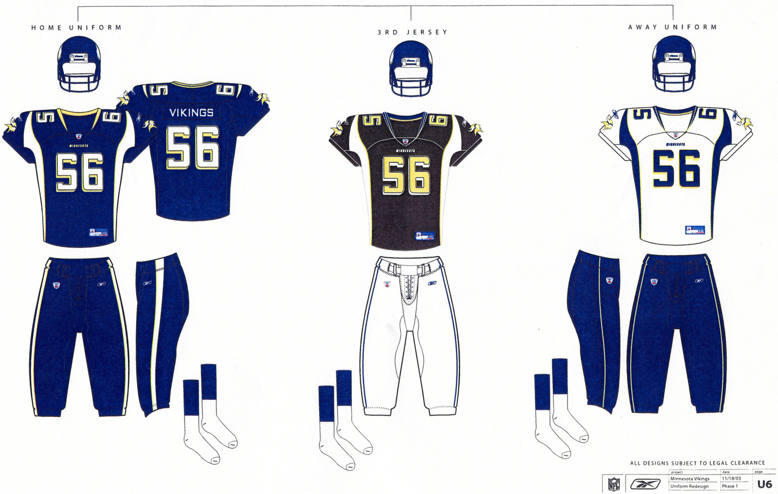
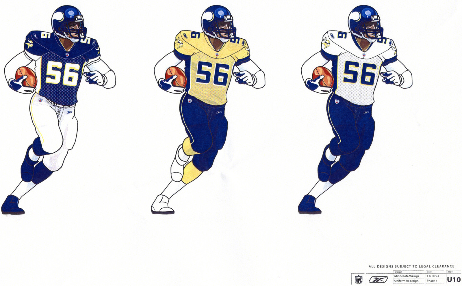
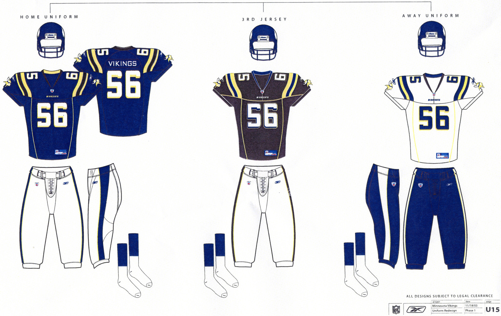
Design One
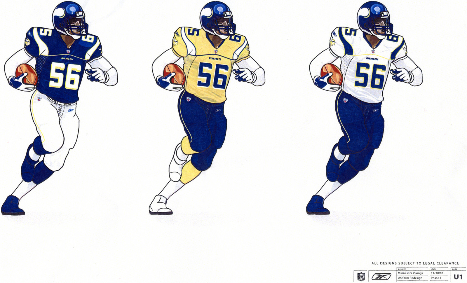

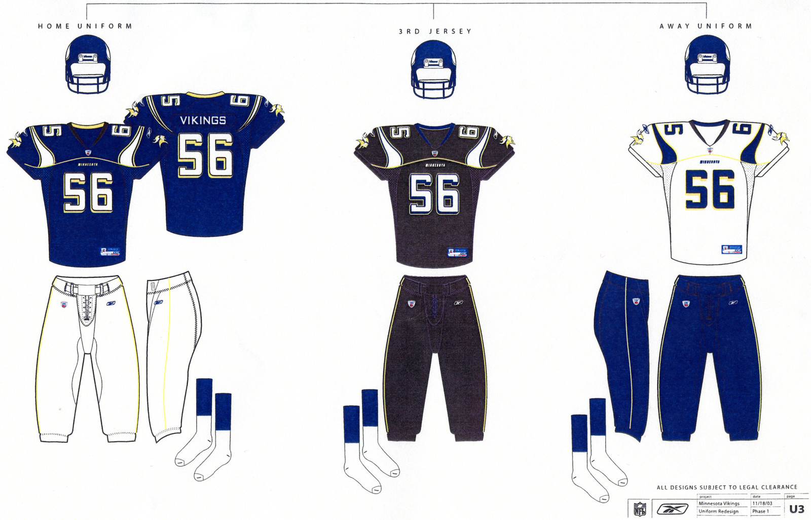
Notes: The horn-shaped shoulder stripe is similar to what the Vikes eventually did with their 2006 redesign, but the horns don't connect to contrast-colored side panels in this version. ... The pants striping is surprisingly subdued, but the garish horizontal jersey piping more than makes up for that. ... Speaking of garish, those black and yellow alternate jerseys are both brutal -- yikes! (As you'll see, all five of these design proposals included black and yellow alternate options.)
• • •
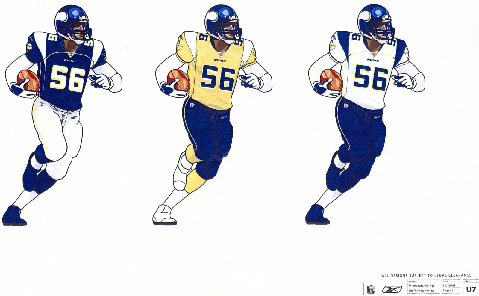
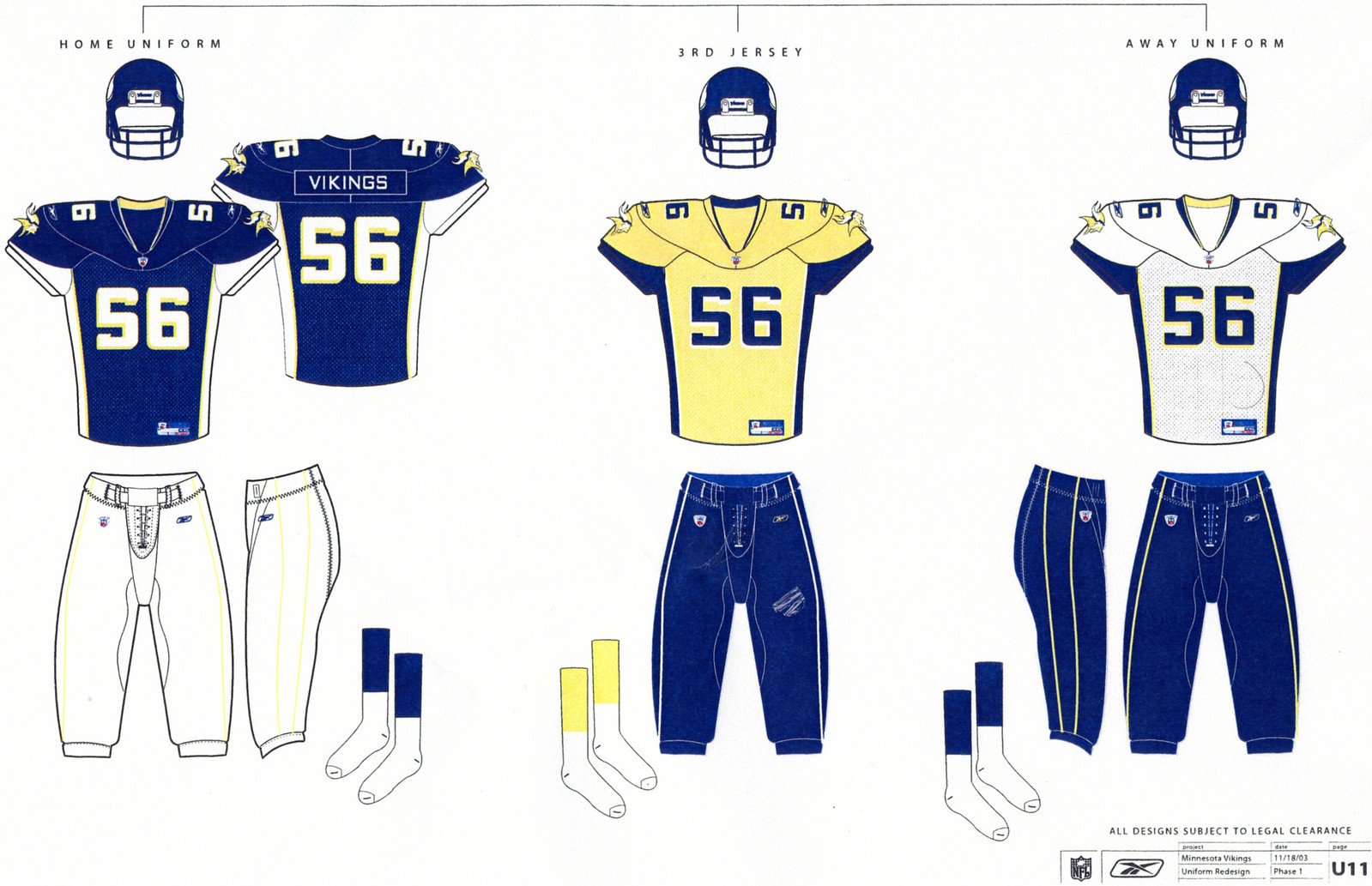
Design Two
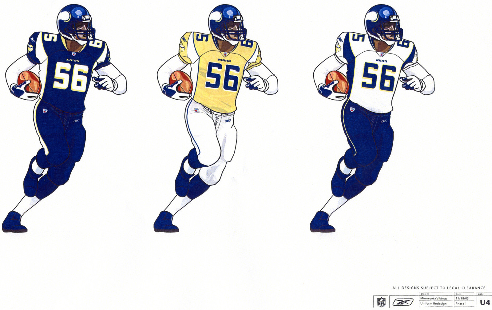
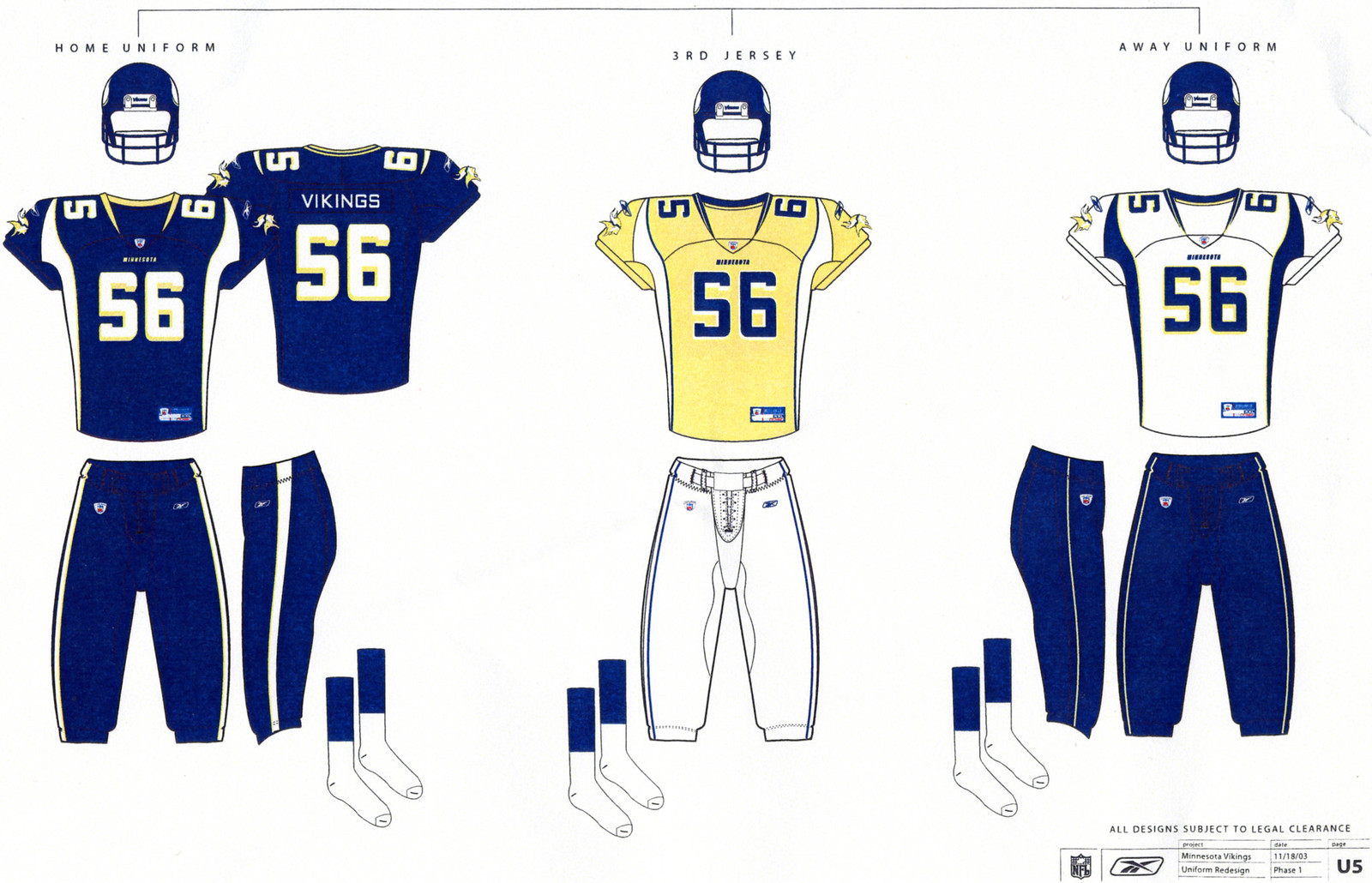
Notes: This version is closer to what the Vikings eventually went with in 2006, with the quasi-horn-like shoulder stripes connecting to colored side panels. ... This time the yellow and black alternate jerseys are both paired with white pants (instead of purple and black, respectively), and the black jersey has yellow uniform numbers. ... Interesting to see that Reebok envisioned the Vikes wearing solid purple as their standard home uni.
• • •
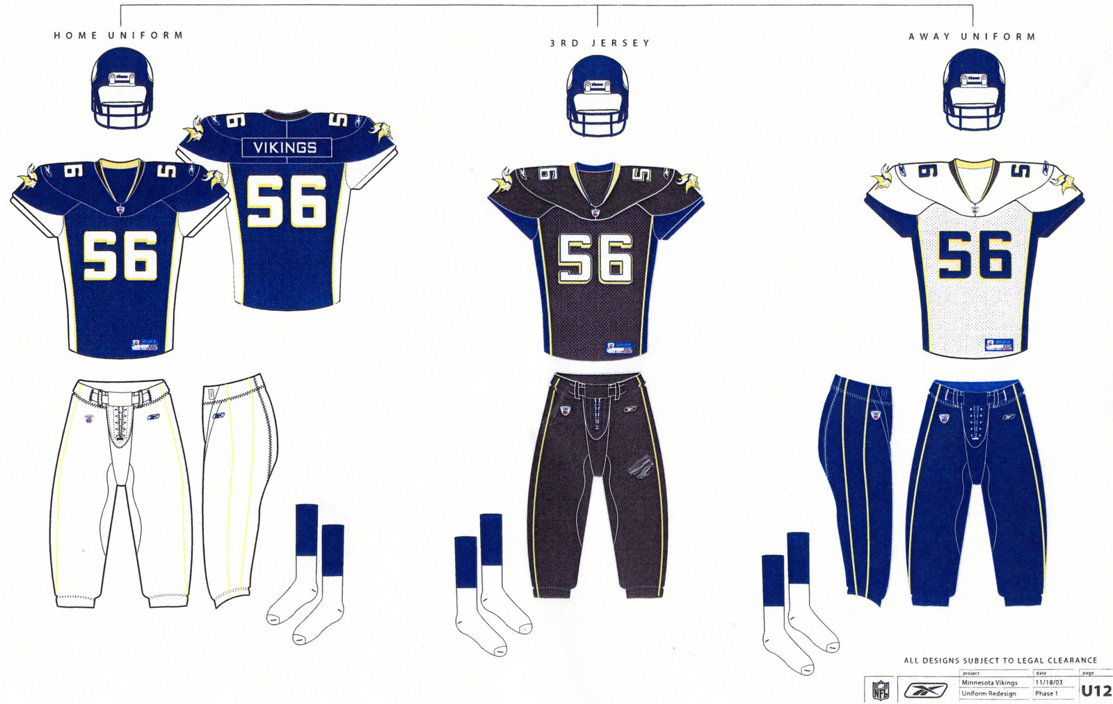
Design Three
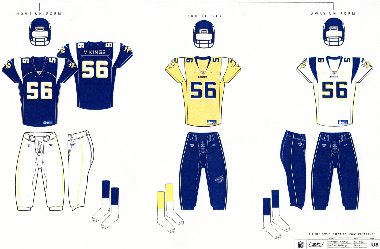
Notes: Similar to Design One, but with wider, less horn-like shoulder stripes. ... The uni numbers on the black alternate are back to white, but this time they're outlined in yellow. It almost feels like Reebok was just playing mix-and-match here. ... The pants striping continues to be very tame.
• • •
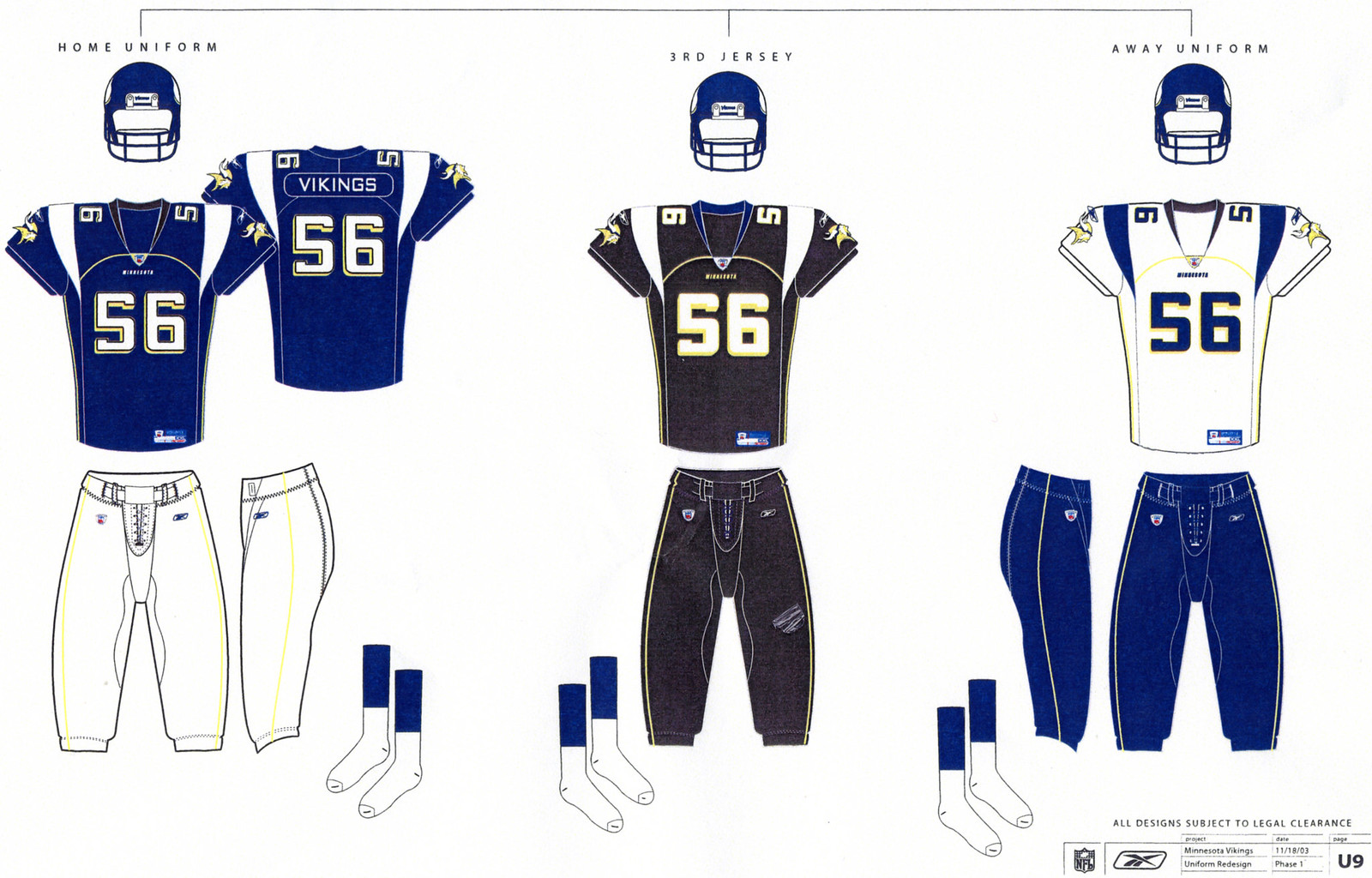
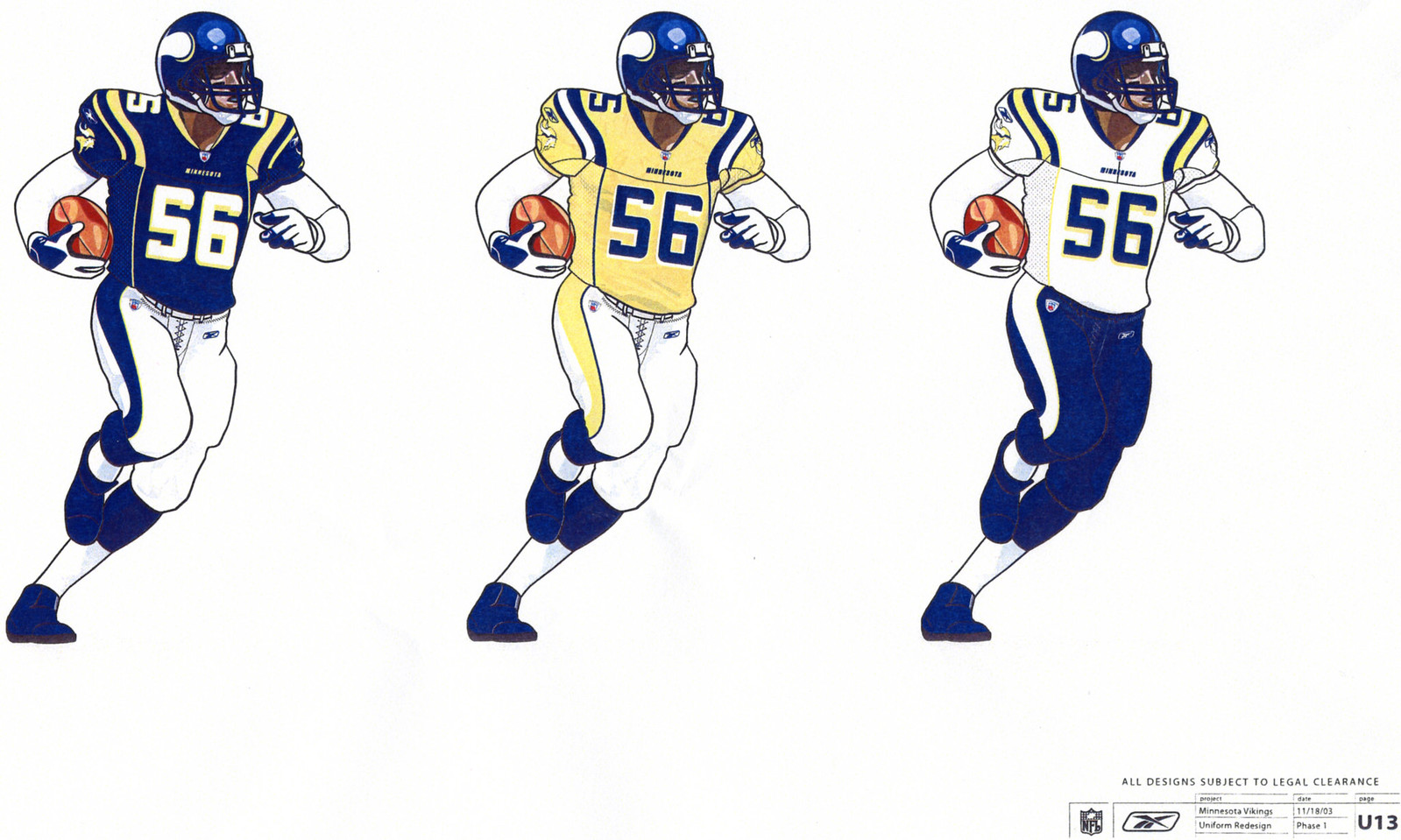
Design Four
Notes: Surprise -- no shoulder stripes! The jersey side panels simply extend into the armpit areas. ... Given how the shoulder striping typically gets distorted on today's super-stretchy jerseys, this design probably would have looked better on the field than any of the others.
• • •
Design Five

Notes: Another shoulder striping option, this time a UCLA-style pattern. Not bad, if you can ignore the vertical piping down the torso. ... Meanwhile, it's interesting to note that all five of these designs kept the Vikings' standard helmet design intact.
• • •
So those are the five concepts Reebok was proposing back in 2003. But wait -- there's more. My source also provided me with an additional round of prototype mock-ups. There's no date on this batch, so we can't be sure exactly when they were developed, but some of the sheets mention Vikings players Daunte Culpepper, Randy Moss and Michael Bennett -- players whose tenures in Minnesota overlapped in 2001 through 2004. It's likely that these designs were produced in 2001 or 2002 (Bennett's only two big years in Minnesota), prior to the designs we just examined. Again, let's go one template at a time:
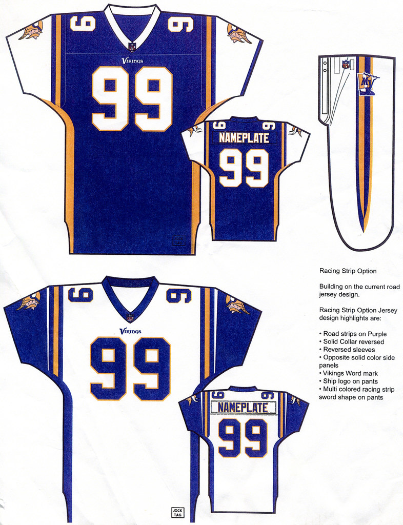
Design Six
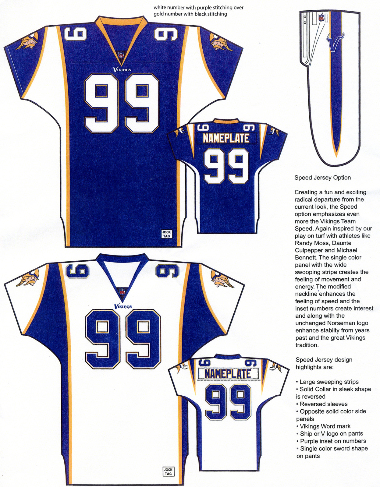
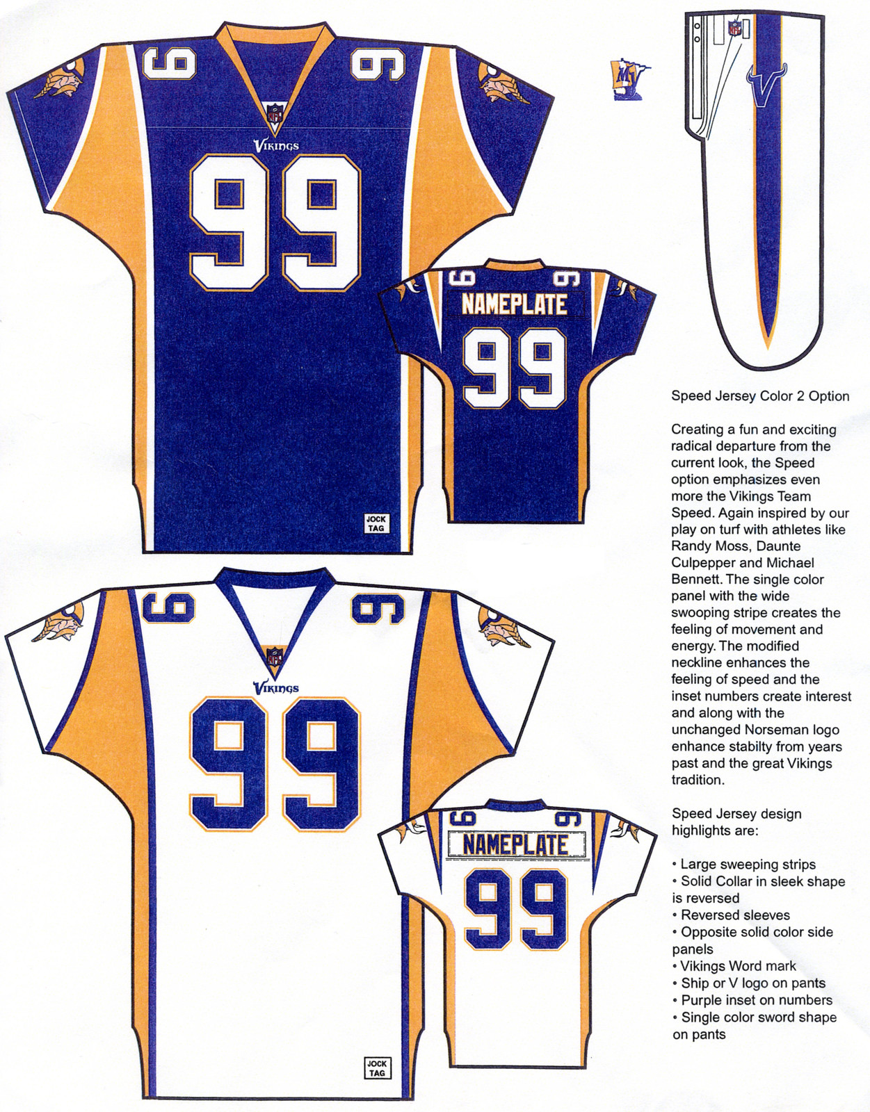
Notes: The "Speed Jersey," with its big, swooping graphics, would have been an eyesore on the field. ... The sword-shaped pants striping isn't bad, however -- Vikings did use swords, after all. In fact, why not include the sword's handle at the top of the stripe?
• • •
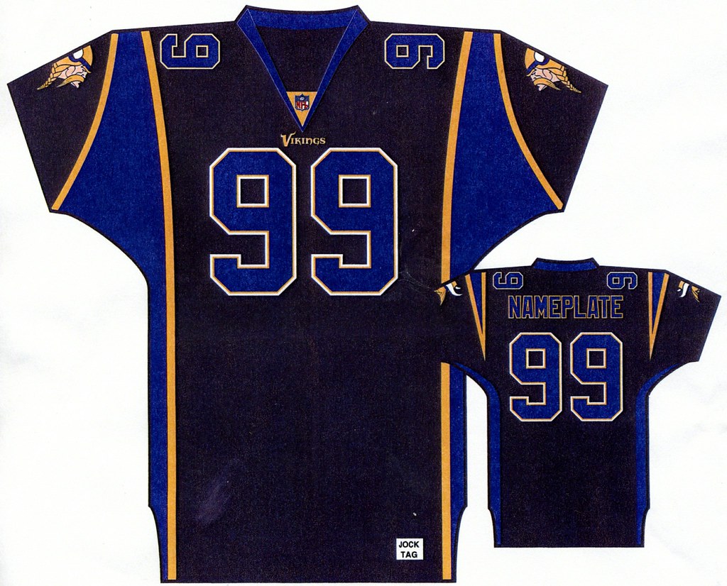
Design Seven
Notes: Probably the worst of all the prototype designs -- what a train wreck! ... The most interesting element is on the hip of the pants, where the Vikings were apparently tinkering with a ship-based secondary logo. That logo, like the rest of these designs, never came to fruition.
• • •
Design Eight
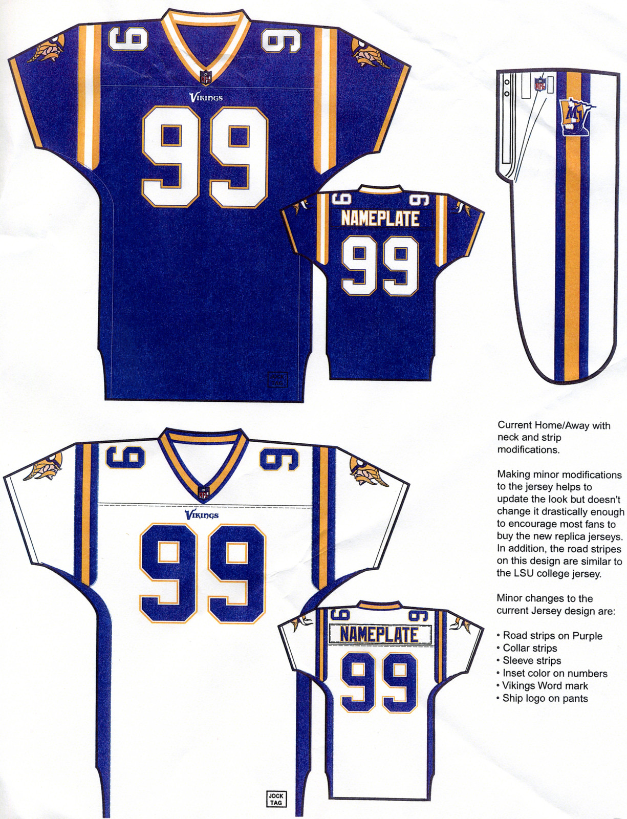
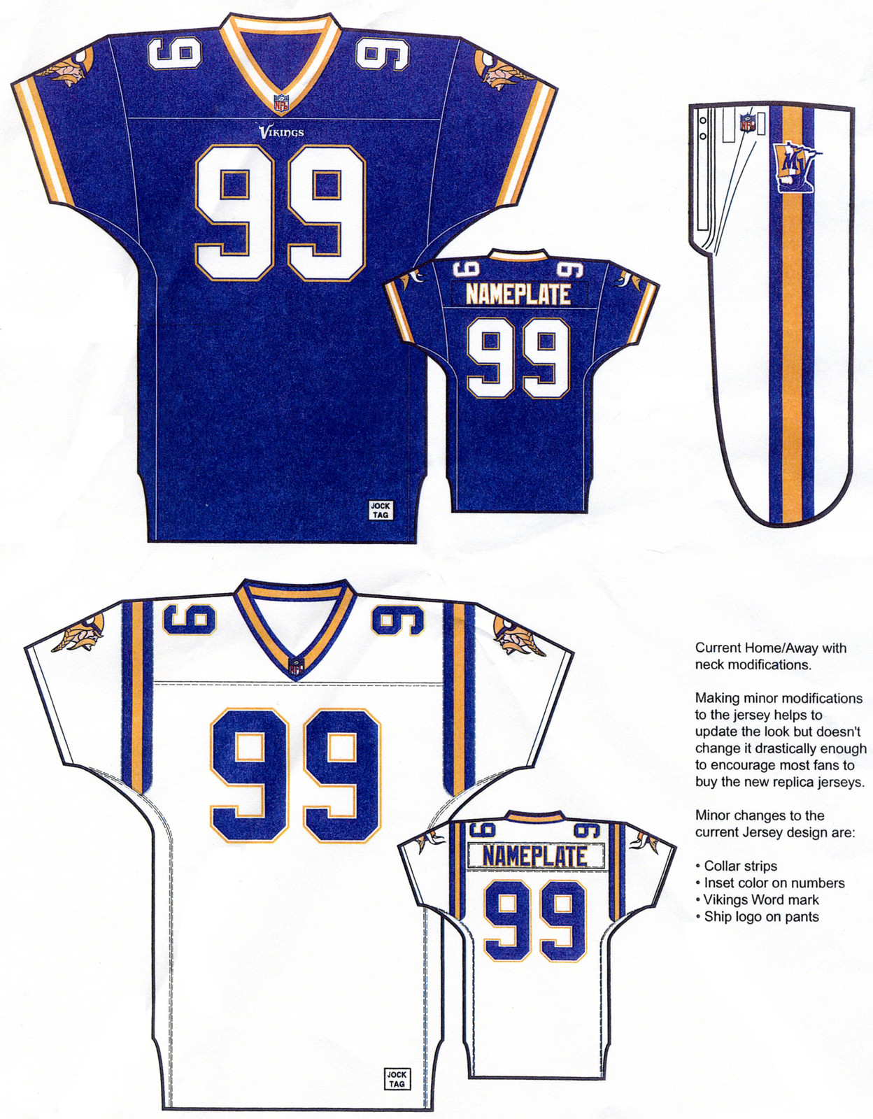
Notes: Here we see that the Vikes also were considering a very conservative update to what they already were wearing at the time, with just a few tweaks to the collar design, shoulder stripes, and hip logo. ... This one might not even be worth including here if not for a rather revealing note that accompanies the designs: "Making minor modifications to the jersey helps to update the look but doesn't change it drastically enough to encourage most fans to buy the new replica jerseys."
Ah, yes, getting fans to buy stuff -- the real reason behind any uniform redesign.
Paul Lukas can't get enough of these old uniform prototype designs. If you liked this column, you'll probably like his Uni Watch Blog, plus you can follow him on Twitter and Facebook. Want to learn about his Uni Watch Membership Program, be added to his mailing list so you'll always know when a new column has been posted or just ask him a question? Contact him here.